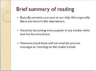
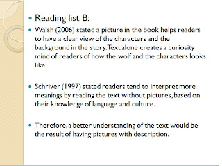
The slide uses a soft tone for the background to reinforce the messages in the slides making it more relaxing tone for readers. Then boldface is used for the headings to create attention of what is title of the discussion is about.

Lastly, bullet points are used to guide readers the flow of discussion (Reep 2006). Another importance would be the distribution of the information of the slides. The layout of text is best to be equilibrium such as the slides flows horizontally from left to right (Berhandt 2009).

From my opinion, the audience are more engaged to the picture slide rather than the other slides.

It shows that the interest of text and visual creates a better view of understand among the audience. Therefore, it is best to refrain from using symbolic icons to confuse the readers. Thus, writing of text should be direct and concise without any information loss.
References:
Bernhardt, SA 2009, ‘Seeing the text’, College Composition and Communication, Vol. 37, No. 1, pp. 66-78
Reep,DC 2006, 'Document Design', Pearson/Longman, New York.
Nielsen,J & Morkes, J 1997,'Concise,Scannable and Objective:How to Write for the Web',Useit.com,viewed 7th April 2010,
Schriver K.A 1997, 'Dynamics in Document Design: Creating Texts for Readers', Wiley Computer Pub., New York.


